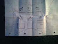
Final:
Changes made while designing the magazine pages:
i changed the typeface used for codes. So the typeface used before was Airel 6pt bold to Times Roman (Red and Green). Red and Green was chosen so the magazine pages ties in with the same look as the front cover.
This blog is all about my inspiration! All graphics, music and writing!
Monday, 19 September 2011
Wednesday, 14 September 2011
TYPOGRAPHY BRIEF- DRAFT & FINAL COPY OF THE FRONT COVER!
 |
| 1st copy- Some of the type was wasn't straight. |
 |
| 2nd copy- The type is much better. |
TYPOGRAPHY BRIEF- RESEARCH AND SKETCHES!
I was given a typography brief which was to design a magazine. Using the images provided to me i formed a cover story titiled Typography on the Streets.
Before designing the magazine in Adobe Indesign i did some reserach on page layouts. The whole purpose of this was to look at how to arrange images with text as well as, researching how text is edited in a magazine.
For my reaserch i have looked at RWD Mag and a Typography book titiled Creative Type to gain inspiration.
Looking at the research i decided to sketch a few rough ideas in my sketchbook. My ideas briefly shows an idea of how i might what the text to be layed out on two or single page spreads.
DESIGNING THE PURSE...
 |
| Firstly, i have made a template to design the purse. The template was designed in Adobe Illustrator. |
 |
| Afterwards, I had to sew the material halfway leaving a gap on the top. |
 |
| The next step was to turn the material inside out. So the threads won't be shown. |
 |
| To make my first ruffle i had to sew a piece of material while pulling it at the same time. Until the ruffle forms into its own shape. |
 |
| The next step was to sew on the first ruffle. The ruffle could be sewn anywhere on the purse however i have sewn the ruffle, around the edge of the purse. |
 |
| To complete the casual look. I have decided to cut another piece of my jeans, cutting it into a curvy shape like before. Sewing it in the middle of the purse. |
 |
| To decorate the purse i have taken 30cm of ribbon, then sewn it around the flap and front section of the purse. |
 |
| Adding the ribbon (example 2) |
 |
| Adding the ribbon 3. In this section of the purse i have decided to create a loop to produce a hook which is used to close the purse. |
 |
| Lastly sew a button in the middle of the purse. |
Tuesday, 13 September 2011
FINAL OUTCOME OF SCARF PATTERN SET!
The first image above shows what is required within the set. Even presenting what the final outcome looks like. When producing the scarf pattern pieces i used the drafts to design the scarf samples.
The purse is the packaging for the scarf patterns.
DRAFTS & FINAL OUTCOMES OF THE SCARF PROJECT!
Tuesday, 6 September 2011
HINTS & TIPS PROJECT IMPROVED: NEW RESERCH & SKETCHES!
 |
The idea of my textile pattern piece pack came from a book called promo art. I was inspired how simple the idea was, and how easy it can instruct people to make a card creatively. |
 |
| sketches of my purse idea 1 |
 |
Sketches of my purse idea 2 |
 |
| The purse packaging idea came from the sew book. This idea has been done before however not for textile pieces. |
HINTS & TIPS PROJECT IMPROVED: MAKING THE TEXTILE SCARF PATTERNS. (USING ADOBE ILLUSTRATOR)
 |
The next step was to transfer the drawn illustrations onto textile pieces i've designed in Adobe illustrator. Beforehand ealier in this project i have already started produced the pattern pieces by hand using coloured paper to test out the design. The reason why i've redefined them in illustrator is because they wasn't professionally made properly. To the measurements of 11.69 to 8.27 inches.
 |
| The wrap pattern (before). |
HINTS & TIPS PROJECT IMPROVED: WRAP!
 |
To make a big square shape trace a pattern taken from Cath Kidson's sew pattern sheet. This pattern is traced onto greaseproof paper using a pencil. |
 |
| Afterwards, cut out the pattern using scissors. So the pattern could be used to make the scarf. |
 |
Now, place the pattern onto your chosen material, to transfer the pattern template onto your material cut around it. |
 |
To make a extra pattern which is a square, you have to trace the pattern from the same tracing sheet used before. |
 |
| Now, cut out the square pattern using scissors. |
 |
| To transfer the square shape onto any chosen material, place the template onto the material; and cut around it. You can cut any amount of squares out using the template repeatedly. |
 |
| Now, sew on the squares onto the material which was cut out earlier. |
 |
Then sew on any ribbon. |
 |
| The scarf is designed for your neck, to put it on just tie around your neck. |
Subscribe to:
Comments (Atom)


